A store can look beautiful and still confuse shoppers. Another can feel simple, clear, and easy to buy from, even without a fancy design. At SAL Accounting, we work with eCommerce stores that are trying to understand both sides of growth: what customers see on the website, and what the business actually keeps after sales, fees, refunds, and tax.
Shopify merchants generated $14.6 billion over BFCM 2025, so strong stores now need more than good visuals. They need clear pages, smart product explanations, trust signals, and a smoother path to checkout. In this post, you’ll see real Shopify store examples by industry, what each one does well, and simple Shopify store ideas you can use on your homepage, product pages, and CRO fixes.
Quick Takeaways
- The best Shopify store examples are not just “nice-looking” stores. They make buying feel simple.
- Great Shopify store design usually has clear navigation, strong product photos, trust signals, fast mobile pages, and product pages that answer real buying questions.
- You do not need to copy a brand’s colours, fonts, or tone. Copy the pattern behind the page instead.
- Start with your homepage and product page before adding more apps. Shopify themes already give you sections, blocks, templates, and layout options.
- A high converting Shopify store usually removes confusion. That means fewer vague claims, clearer product details, easier shipping info, and a checkout path that feels safe.
- If your Shopify store is growing but your numbers are starting to feel harder to trust, that usually means sales, fees, refunds, tax, and payouts need to be easier to read.
Before you redesign, check what Shopify fees are really taking from each sale with the Shopify Fee Calculator.
What Makes the Best Shopify Store Examples Worth Studying?
A successful Shopify store has a clear brand promise, easy navigation, strong product photography, helpful product details, visible trust signals, and a simple checkout path. The best Shopify store examples do not just look good. They make it easy for shoppers to understand the product, trust the brand, choose the right option, and buy without second-guessing. Basically, do not ask, “How can I make my site look like this?” Ask:
- What does this store explain quickly?
- What does it show before asking for the sale?
- Where does it reduce doubt?
- How does it guide shoppers from homepage to product page?
- What would make sense for my own product?
That last question matters. A supplement store, fashion brand, food brand, and home goods store should not all look the same. The pattern can be similar, but the execution should fit the product.
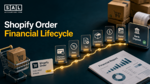
For Shopify sellers, this is where the storefront and the numbers start to overlap. A cleaner buying journey may increase sales, but Shopify bookkeeping and accounting is what helps you see what those sales actually leave behind after fees, refunds, discounts, tax, product costs, and payouts.
Shopify’s own store examples are useful because they group stores by category. That is the right way to look for inspiration. A fashion store, skincare store, food brand, and home goods store should not all use the same design choices.
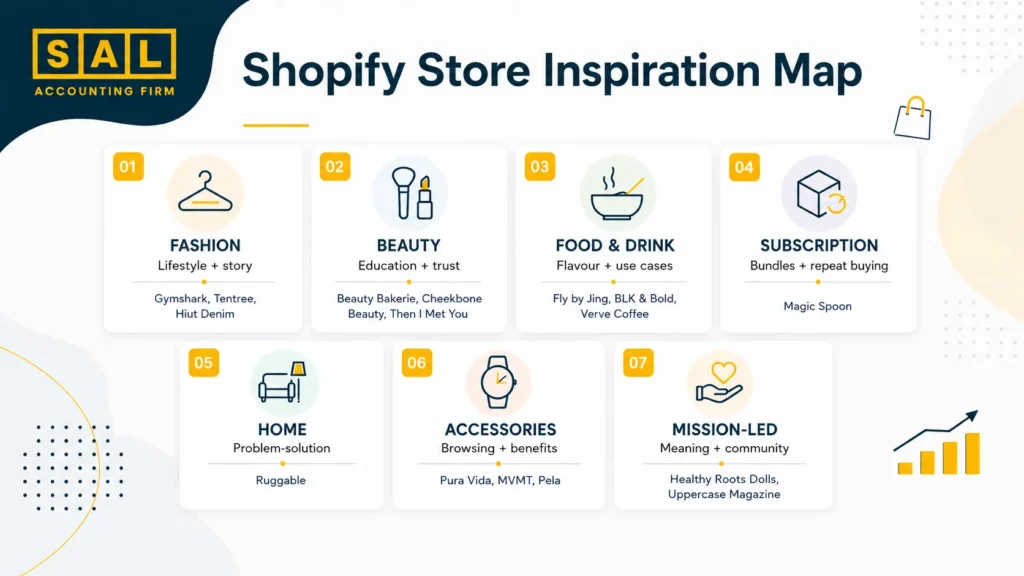
Quick Shopify Stores List by Industry
Use this Shopify stores list as a starting point. Do not study every store at once. Pick your category, choose two or three examples, and look at one page at a time.
| Industry | Stores | Pattern | Page |
| Fashion | Gymshark, Tentree, Hiut Denim | Lifestyle + story | Homepage, product page |
| Beauty | Beauty Bakerie, Cheekbone Beauty, Then I Met You | Education + trust | Product page |
| Food | Fly by Jing, BLK & Bold, Verve Coffee | Flavour + use cases | Homepage, product page |
| Subscription | Magic Spoon | Bundles + repeat buying | Product page |
| Home | Ruggable | Problem-solution | Product page |
| Accessories | Pura Vida, MVMT, Pela | Browsing + benefits | Collections, product page |
| Mission-led | Healthy Roots Dolls, Uppercase Magazine | Meaning + community | Homepage, About page |
When you start comparing themes, apps, and store features, Shopify pricing in Canada is worth keeping in the background. Design choices are not just visual. They can change your monthly costs, app stack, and reporting setup too.
Best Shopify Store Examples in Fashion and Apparel
Fashion stores have one big job: help shoppers picture themselves using the product. That sounds obvious. But a lot of new stores only show flat product photos, a short description, and a size dropdown. That is not enough.
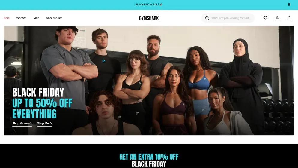
Gymshark: Community Before Product
Gymshark works because the store does not only sell workout clothes. It sells the feeling around training, progress, and being part of a fitness community. What to copy:
- Use lifestyle images, not only product-only photos
- Show your product in real use
- Build collections around customer goals
- Make your homepage feel active, not static
The point is simple. If your product connects to identity, show the identity.
Case Study: How Sarah in Toronto Uses Community to Sell Fitness Apparel1
Sarah runs a small fitness apparel store in Toronto. Her first site looks clean, but it feels flat. The product photos are fine, the prices are clear, and the checkout works. But visitors do not really understand what makes the brand different.
The Problem
The store looks like a product catalog. There is no feeling behind it, so shoppers compare her leggings only on price.
What We Do
We would help her study stores like Gymshark and build more community into the page. That could mean workout photos, founder notes, customer photos, and collections based on training style.
The Result
The store starts to feel like a brand with a point of view, not just another apparel site.
For apparel stores, the backend can get messy just as quickly as the design. Returns, exchanges, size-based inventory, seasonal stock, and discounts all show up in the numbers. That is why clothing boutique accounting belongs in the same conversation as store design.
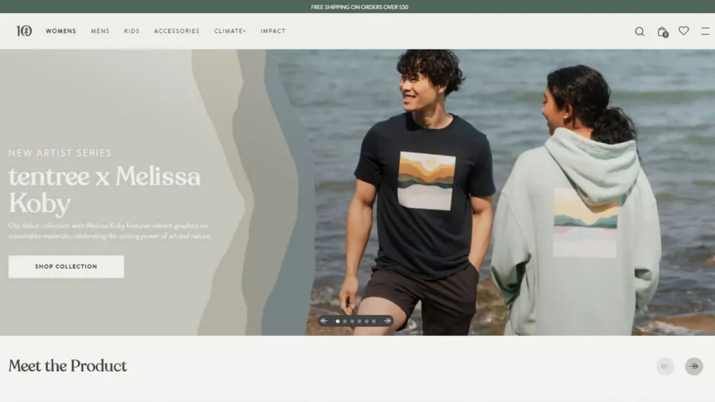
Tentree: Purpose Built Into the Store
Tentree is a strong Shopify website example because its sustainability message is not hidden on an “About” page. The mission sits close to the product. What to copy:
- Explain what makes your product different near the buying moment
- Add short proof points beside product claims
- Avoid vague claims like “eco-friendly” without context
- Show the customer what their purchase supports
This works especially well if your store sells sustainable products, ethical goods, handmade items, or mission-led products.
Hiut Denim: Make the Product Feel Specific
Hiut Denim does not try to sell every type of clothing. It focuses tightly on denim, craft, and place. What to copy:
- Make your product category feel focused
- Use product details to build trust
- Tell the story behind the product without making it too long
- Keep product pages clean and confident
A focused store often feels stronger than a store trying to sell everything.

- Read more: “Best Shopify Plan for Beginners”
Best Shopify Website Examples in Beauty and Wellness
Beauty and wellness stores need to answer more questions than fashion stores. What is in the product? Who is it for? How do I use it? Will it work for my skin, hair, routine, or lifestyle? That is why the best Shopify websites in this category usually do three things well: visuals, education, and trust.
Beauty Bakerie: Branding People Remember
Beauty Bakerie stands out because the brand world is easy to remember. The product names, packaging, and visuals all support the same idea. What to copy:
- Make product names easy to remember
- Use a clear visual theme
- Keep packaging and website design connected
- Make product categories feel fun without making them confusing
Now, do not force a cute concept if it does not fit your brand. The lesson is consistency, not playfulness.
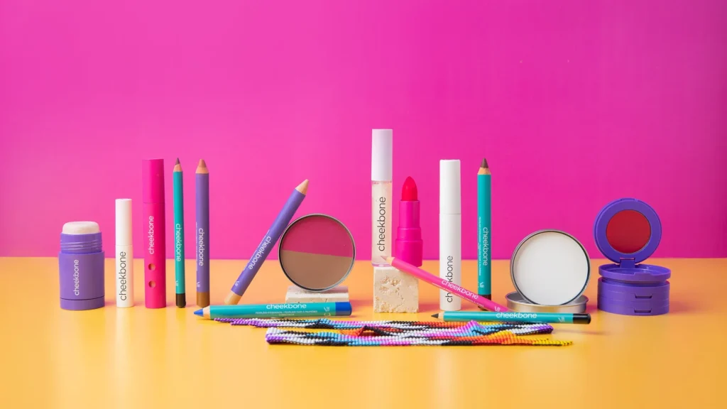
Cheekbone Beauty: Mission That Feels Real
Cheekbone Beauty is a good example of values-led Shopify store design. The mission supports the brand, but the products still need to stand on their own. What to copy:
- Put mission and product quality together
- Show real people using the product
- Explain ingredients, shades, or use cases clearly
- Add proof near the product, not only in a separate section
This is where clear product structure matters. Discounts, bundles, refunds, and promotions can make sales look simple on the website but messy in the bank. Ecommerce payment reconciliation is the part that keeps the story straight after the sale happens.
Then I Met You: Education Without Overwhelming the Shopper
Skincare shoppers often need guidance. Then I Met You uses founder story, product education, and routine-based selling to make the products easier to understand. What to copy:
- Explain when and how to use the product
- Use routines if your products work together
- Add FAQs to product pages
- Use reviews that mention real outcomes
Pro Tip: If your product needs explanation, do not hide the explanation in a blog post only. Add the short version directly on the product page.
Shopify Store Examples in Food, Drink, and Subscription Products
Food and drink stores have a different problem. Shoppers cannot taste the product. So the website has to do more work. It needs to sell flavour, use cases, trust, and repeat buying.
Fly by Jing: Make the Product Feel Vivid
Fly by Jing uses strong visuals, bold colour, and food storytelling to make the product feel alive. What to copy:
- Show the product in use, not only in the jar or bottle
- Add serving ideas
- Explain flavour in plain language
- Use recipes or meal ideas to make the product easier to imagine

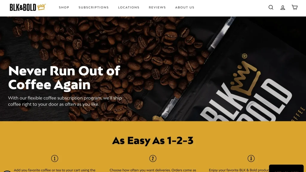
BLK & Bold: Give the Purchase Meaning
BLK & Bold connects coffee with purpose. The product matters, but the mission adds another reason to care. What to copy:
- Explain what the customer supports
- Keep the buying path simple
- Use mission carefully, without making every section about it
- Add proof, certifications, or partner information where relevant
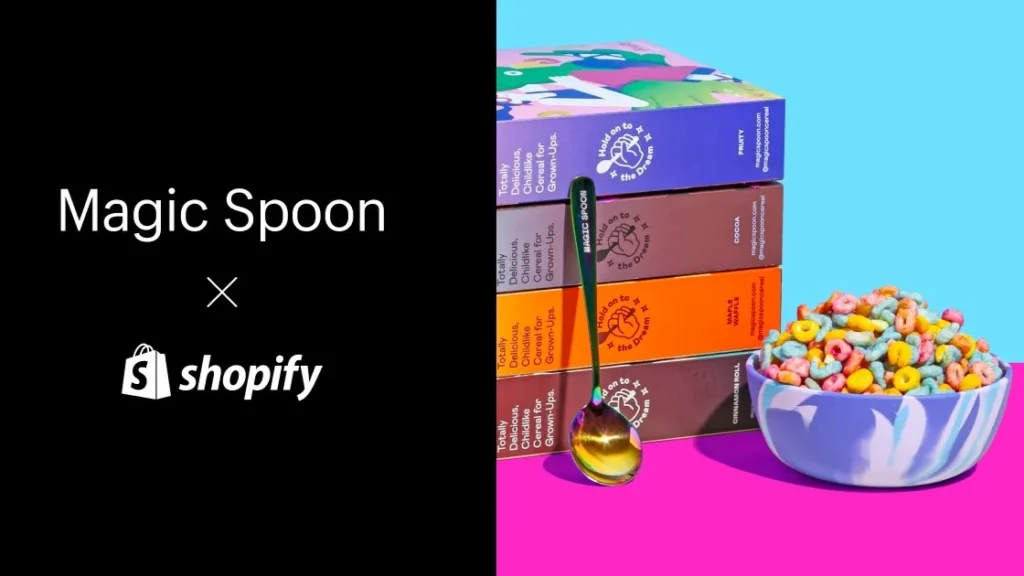
Magic Spoon: Make Subscription Choices Easy
Magic Spoon is useful to study because cereal is a repeat-purchase product. The site has to make bundles, flavours, and subscriptions easy to understand.
Shopify’s Magic Spoon case study says the brand uses Shopify to test quickly, improve conversion, and expand across product categories and sales channels. What to copy:
- Show bundle savings clearly
- Make flavours easy to compare
- Explain subscription benefits before checkout
- Let shoppers understand the first order quickly
Case Study: How Liam in Mississauga Makes a Food Product Easier to Buy2
Liam sells premium sauces from Mississauga. People love the product at local markets, but online sales are slower. The issue is not the product. The issue is that the website does not show how to use it.
The Problem
The product page has one jar photo, a short description, and a price. New visitors do not know what it tastes like, what meals it works with, or which flavour to try first.
What We Do
We would help him borrow the pattern from brands like Fly by Jing and Magic Spoon: recipes, serving ideas, flavour notes, bundles, and a clear starter pack.
The Result
The page gives shoppers enough context to choose. They are not just buying a jar. They understand how it fits into dinner tonight.
Once subscriptions, bundles, and refunds enter the picture, Shopify payment reconciliation becomes more important. A $60 order on the product page may not land as $60 in the bank, and that gap needs to be easy to explain.
- Read more: “Best Shopify Dropshipping Apps”
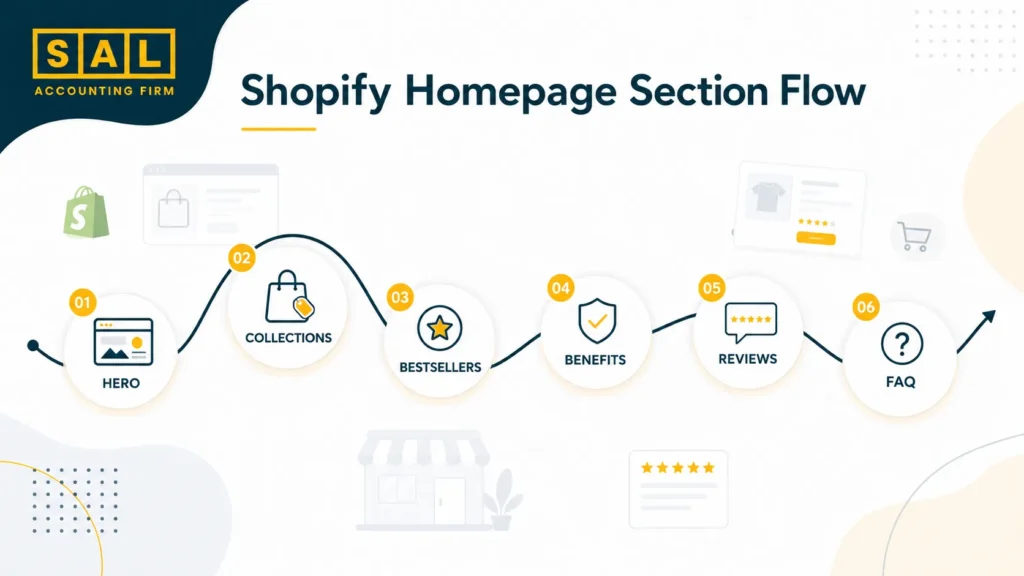
Shopify Homepage Design Patterns From High-Converting Stores
Your homepage does not need to tell your full story. It needs to help a new visitor understand three things fast:
- What you sell
- Why it is worth buying
- Where they should go next
Here’s the homepage version in a simpler, more useful format.
| Section | Job | Best For | First Fix |
| Hero | Explain fast | Every store | Sharpen headline |
| Collections | Guide browsing | Multi-product stores | Add 3–5 categories |
| Bestsellers | Reduce choice | Large catalogs | Show top products |
| Benefits | Explain value | Practical products | Add 3 proof points |
| Reviews | Build trust | Most stores | Move proof higher |
| FAQ | Remove doubt | Sizing or shipping issues | Answer top 3 questions |
Shopify’s sections and blocks let merchants arrange text, buttons, images, collages, links, and app content without editing code.
That matters because you may not need a redesign first. You may need a better section order.
If you are still choosing where to build or move your store, Shopify vs WooCommerce gives useful context around platform setup, flexibility, cost, and management. If Amazon is part of your plan too, Shopify vs Amazon FBA is a different decision because fulfillment, fees, customer ownership, and reporting all change.
Pro Tip: Before changing your theme, write down the job of each homepage section. If a section does not explain, guide, prove, or sell, it probably needs to be removed or rewritten.
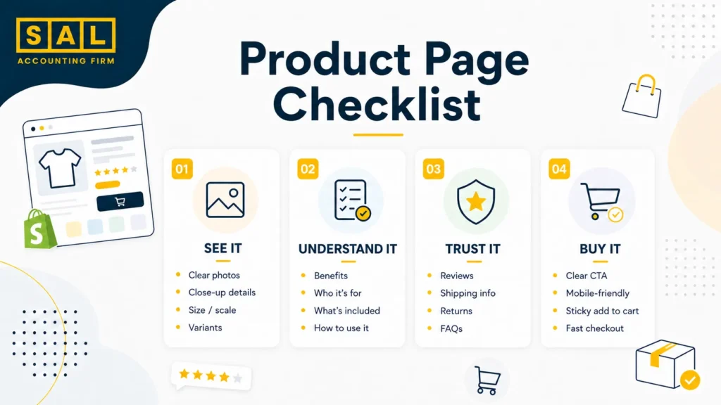
Shopify Product Page Ideas That Help Shoppers Decide Faster
Product pages are where a lot of stores quietly lose money. Not because the product is bad. Because the page leaves too many questions open.
Show the Product Clearly
Use photos that show:
- The full product
- Close-up details
- Size or scale
- Product in use
- Packaging, if it matters
- Variants, colours, or flavours
Basically, your product page should answer, “What am I actually getting?”
Answer Buying Questions Before Checkout
A strong product page explains:
- Who the product is for
- What problem it solves
- What is included
- How sizing, flavours, colours, or variants work
- Shipping timing
- Return rules
- Subscription terms, if relevant
This does not need to feel heavy. Short, clear sections are enough. Product clarity also affects what happens after delivery. Fewer surprises usually means fewer support tickets, fewer preventable returns, and a cleaner Shopify refund policy experience for the customer.
Use Reviews Near the Decision Point
Reviews work best when they sit near the product details, not buried at the bottom. Look for reviews that mention specific things:
- Fit
- Quality
- Taste
- Texture
- Delivery speed
- Customer service
- Repeat purchase reasons
A vague “love it” review is nice. A review that says, “I was worried about sizing, but the guide was accurate” removes a real concern.
Keep Mobile Product Pages Simple
Most shoppers will not read a huge block of text on mobile. Use:
- Short product descriptions
- Collapsible FAQ sections
- Sticky add-to-cart buttons, if your theme supports them
- Clear variant labels
- Reviews that are easy to scan
- Fast-loading images
Google’s Core Web Vitals are a useful way to think about page experience because they measure loading speed, responsiveness, and visual stability.
For stores with variants, bundles, inventory, and product costs, product pages are not just a design issue. Shopify inventory accounting helps you understand whether the products that look good on the page are actually profitable.
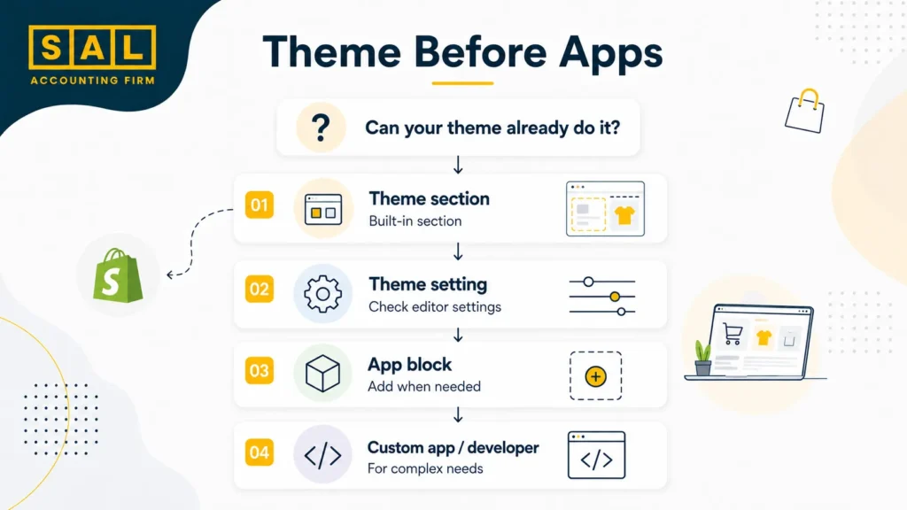
Best Shopify Themes and Native Features to Use Before Adding More Apps
A lot of new merchants jump straight to apps. Sometimes that makes sense. But too many apps can slow the site, clutter the admin, and make the store harder to manage. Start with your theme first. Shopify Online Store 2.0 gives merchants more flexibility with sections and templates across different page types. Look for themes that support:
- Strong product media
- Collection filters
- Quick buy
- Collapsible product information
- Recommended products
- Reviews or app blocks
- Email signup
- Blog or guide sections
- Mobile-friendly navigation
Here’s a tighter way to think about theme and feature choices.
| Need | Theme Feature | App Category | First Fix |
| Many products | Filters | Search/filter | Clean categories |
| Product education | Rich templates | FAQ/reviews | Add FAQs |
| Repeat purchases | Subscription layout | Subscription | Starter bundle |
| Large images | Fast media | Image compression | Resize files |
| Complex variants | Clear selectors | Product options | Rename variants |
| Email growth | Signup section | Email marketing | Add useful offer |
For many stores, a good Shopify theme plus thoughtful page structure is enough to make the store look much more professional.
When the tool stack starts growing, keep it intentional. Best Shopify integrations is useful for thinking through which apps actually support the store instead of just adding noise. On the finance side, best accounting software for Shopify sellers become more relevant once fees, sales tax, inventory, and product costs are too much for spreadsheets.
- Read more: “Shopify Accounting Best Practices”
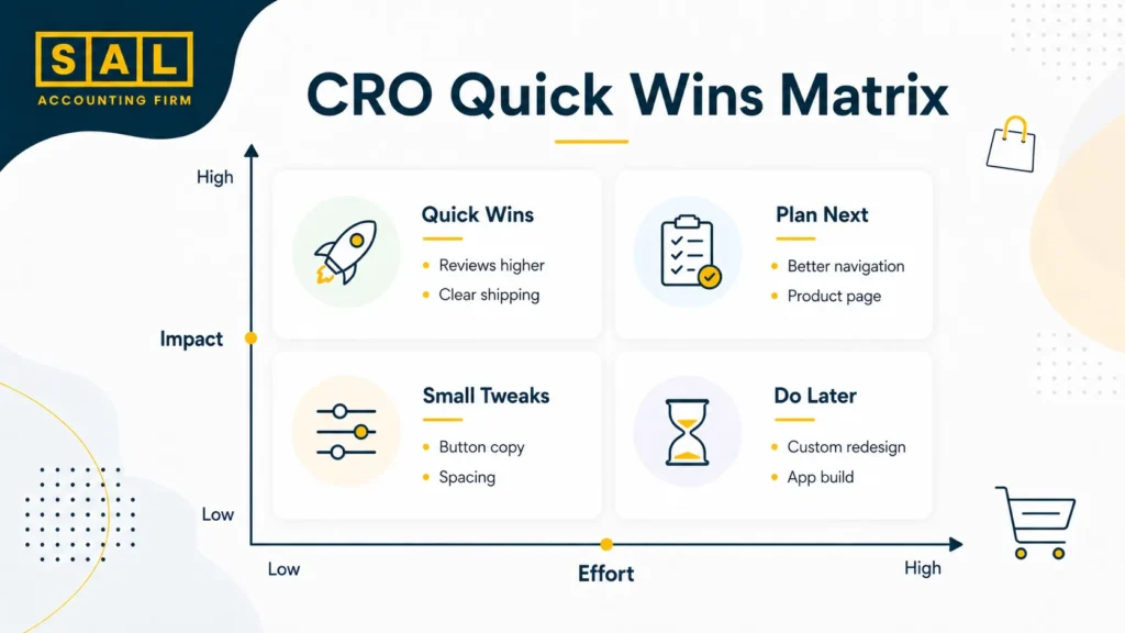
Shopify CRO Tips: What the Best Shopify Stores Usually Get Right
CRO means conversion rate improvement. In plain English, it means helping more visitors take the next step, like adding to cart, starting checkout, or buying. Here’s a quick CRO table that keeps the focus on simple fixes, not theory.
| Fix | Improves | Check First | Easy Update |
| Speed | Drop-offs | Heavy images | Compress files |
| Navigation | Product discovery | Menu clutter | Add bestsellers |
| Product clarity | Buying doubt | Missing details | Add “who it’s for” |
| Reviews | Trust | Proof too low | Move near CTA |
| Shipping info | Checkout doubt | Hidden timing | Add delivery note |
| Bundles | AOV | No starter set | Create one bundle |
Shop Pay can lift conversion by as much as 50% compared with guest checkout. The lesson is not “checkout fixes everything.” It does not. The lesson is that small friction points matter. If someone already wants the product, do not make the final step feel slow, confusing, or risky.
The money side gets affected too. Discounts, bundles, refunds, payment options, and shipping offers all change what actually shows up in your reports. A clean Shopify month-end close checklist gives you a better way to catch those issues before they pile up.
How Allbirds Turns Product Details Into Trust
Allbirds works because the store makes materials feel simple. It does not just say “comfortable” or “sustainable.” It connects materials, product use, and everyday benefits.
The problem with a lot of sustainability messaging is that it sounds nice, but vague. Shoppers may like the idea, but still wonder if the product is comfortable, durable, easy to care for, or worth the price. Shopify’s Allbirds case study points to the importance of connecting customer, inventory, and sales data across online and retail channels.
Mission-led brands often spend more on packaging, content, photography, samples, and product education. Those costs should not disappear into a messy “miscellaneous” bucket. Ecommerce tax deductions gives those expenses a clearer place in the bigger picture.
How to Use Shopify Store Inspiration Without Making Your Site Look Generic
This is where a lot of merchants get stuck. They look at the best Shopify store examples, pick a few designs they like, and start copying surface-level details. Same big hero image. Same neutral colours. Same product grid. Same “as seen in” strip. But if the brand behind it is different, the copy will feel flat. Use this filter instead.
Copy the Buying Pattern, Not the Brand Identity
If a store uses a quiz well, think about whether your shoppers need help choosing.
If a food brand uses bundles, ask whether your customers also buy in sets.
If a fashion brand leads with lifestyle images, ask whether your product needs more context.
Copy the Page Job, Not the Page Design
If a homepage pushes bestsellers first, ask if your store also needs a clear starting point.
A homepage section should have a job. It should explain, guide, prove, or sell. If it does none of those things, it is probably just decoration.
Copy the Clarity, Not the Wording
If a product page explains benefits well, rewrite your own benefits in your own voice.
This is especially useful if you are still building your first store. Ecommerce beginner tips can keep the basics clear before the store gets layered with apps, ads, tax settings, and multiple sales channels.
Fix One Page at a Time
Start with:
- Your best-selling product page
- Your homepage
- Your top collection page
- Your cart
- Your checkout flow
Then watch what changes.
If Shopify sales are growing, the store changes will eventually show up in your numbers. More discounts, refunds, payment fees, shipping costs, and sales tax questions can make reports harder to trust. That is when ecommerce accounting support starts to matter, because the goal is not just more sales. It is knowing what the store actually keeps.
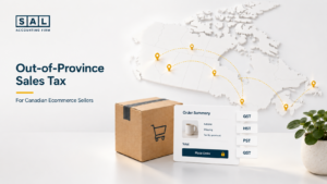
For Canadian sellers moving into the US, the design conversation can also turn into a tax conversation. Shopify sales tax reporting, and Shopify GST/HST tax are worth reviewing before platform reports, Canadian tax, and US sales tax start getting mixed together.
- Read more: “Shopify Payment Reconciliation Guide”
The Best Shopify Store Ideas Are the Ones Your Customer Can Feel
The best Shopify store examples are not useful because they look expensive. They are useful because they show you what clarity looks like. A strong Shopify store helps shoppers understand the product, trust the brand, choose faster, and buy with less doubt.
So start small. Pick one pattern from this guide. Add a better homepage section. Rewrite one product page. Move reviews higher. Clarify shipping. Build a starter bundle. The point is to make your store easier to buy from, not just nicer to look at.
If your Shopify store is growing and you’re starting to wonder whether your sales, fees, refunds, and profit actually make sense, contact SAL Accounting and get a clearer sense of what needs attention.